Of all the new features in Photoshop 4, I am most excited about the new Content-Aware Scaling feature.
When laying out a website design I tend to spend way too much time sourcing images that will suit the design, and more importantly, the design layout. This is a task that all designers have to contend with and unless the client supplies good quality image files, one that will always be necessary.
Finding a suitable image is only half the battle though. The chosen picture often has to fit into a box in your design, and if your designated image area is a landscape rectangle this can mean that you miss out on using many otherwise suitable portrait images, or vice versa.
That’s where Photoshop 4’s Content-Aware Scaling will hopefully come to the rescue. This new feature allows you to scale an image horizontally or vertically without the resulting stretching or squashing that usually results from only scaling along one axis.
The system works by stretching only the unimportant background information while keeping the subject intact.
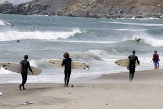
The original image

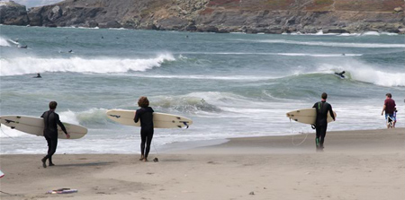
The content-aware scaled image

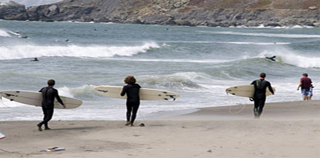
The difference between the 2 images above, from the Adobe website, is subtle and nicely demonstrates how the system works: the image has been stretched but three surfers and the man and child are still in perfect proportion. The only elements that have been stretched are the sand, the sea and the rocks. Simply stretching the image horizontally in an image editor would have produced ‘fat’ surfers.
The image using traditional stretching, with our fat surfers

Granted, you won’t be able to use this technique for all images, but hopefully it will give us designers just that extra few pixels to fill an image box without us having to get out the clone brush or crop out too much of an image.
This new Photoshop feature is remarkably similar to the ‘seam carving’ work done by Shavi Avidan and Ariel Shamir, which I got excited about after seeing it on the web last August. A video of their presentation is online here, www.seamcarving.com. Perhaps Photoshop caught the buzz that surrounded their demonstration and incorporated into this version of Photoshop.
There are some clever people out there…
Now I’m just waiting for the one-click ‘cut-out-a-head-with-really-messy-hair-set-against-a-multicoloured-background’ feature!
