Elixirr Digital and a small group of UK customers are currently testing the new AdWords interface.
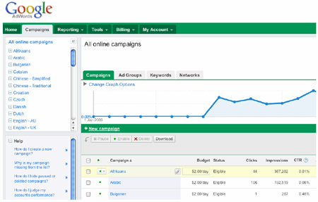
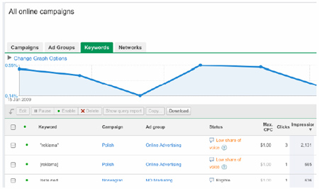
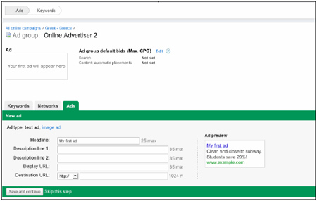
Below are some screen shots of the new AdWords system. As you will see the updated interface is quite different in style but also slick in its load time from our usage so far.
Campaign Level Screen shot:

Keyword level screen shot:

Ad Group / add New creative level screen shot:

A number of changes have been made to the campaign management, here is an update of the areas Google are trying to improve:
- Easier account navigation through a left-hand account tree.
- In-line editing of keywords, bids, ads and placements.
- Integrated reports available on campaign management pages.
- Roll-up views of all keywords, ads and placements in a campaign.
- Streamlined copy/move feature for keyword lists.
- Performance summary graphs for quick trend-spotting
Overall the access to reports / performance etc is very quick and easy. It seems lots of the focus of these changes is to again keep the usability simple but also integrate lots of new tools like filters, clearer access to placements and higher visability of the content network performance.
Elixirr Digital will be posting further feedback on the blog as we continue with the BETA testing.
