About three weeks ago, we reported that the former editor of Scotsman.com, Stewart Kirkpatrick, was planning to launch an online newspaper in Scotland.
At the time, Kirkpatrick announced that “Scotland needs an intelligent title that uses the internet, not fights against it” and that he’d “signed up leading writers, respected authorities in their fields and asked them to let rip”.
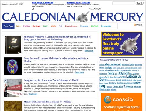
Well, here’s the result:

My first impression was: “Is that it?”
My second was: “What’s that weird blob in the masthead? Is it supposed to be an outline of Scotland?” (After squinting at it for a while, I’ve concluded that it’s supposed to be a puddle of mercury – quicksilver, not the planet).
My third was, surely this has been built on WordPress?
A quick look at the code confirmed the latter (although the normal ‘generator’ meta tag, which normally names WordPress, has been removed). But it’s definitely WordPress, and the admin page has been kept in the default location: caledonianmercury.com/wp-admin/.
A great platform, but…
Personally, I love WordPress. These days, it’s much more than just a blogging platform – it’s a great content management system. With a bit of nipping, tucking and tweaking, it’s also great for search engine optimisation.
It’s just a shame that the Caledonian Mercury was thrown so sloppily together.
Firstly, take a look at this page. It’s the lead story at the time of writing.

Yes, that’s right – the right column encroaches on the main article. This is in Firefox on the Mac, but it’s the same story in Chrome.
Equally sloppy, the front page shows evidence of poor HTML coding. This item has a stray fragment of comment mark-up, which should be invisible (–>).

Coding hell
Things don’t improve when you do look under the hood. Header tag structure clearly hasn’t been thought out, as this document outline shows. This isn’t just careless – it’s throwing away SEO opportunities.

Equally bad, the header of each document is crammed full of custom CSS that should be called from an external stylesheet, helping to speed up page load times and give search engine spiders easier access to the actual content. This CSS is annotated as:
<!– Custom CSS : http://wordpresswave.com/ –>
This domain belongs to WP Wave, a company that offers ‘Professional WordPress coding’, suggesting that the Caledonian Mercury has used the firm to set up its site.
What about the content?
This is the really tragic thing. The content of the site is good. Well-written, enjoyable, lively in the right places. I had a good laugh at the piece on MacGonagall suppers, and the Robert McNeill sketches are great.
But for a venture that’s aiming to use the internet and not fight against it, it has burst into life way too early – more thought was needed.
For that content to appeal more to readers, the pages have to look a lot better. And for more people to find it via search, the pages need to be much better constructed. Stewart – if you’d like a hand, we can help.
Most of all, though, please change the masthead. It looks like Metal Mickey has been sick in the middle of it.
