It’s the moment that many enthusiasts thought would never happen – Apple has allowed a rival browser onto the iPhone.
And more than a million people downloaded it on the first day.
The browser is of course Opera Mini, which has enjoyed great success on a variety of mobile platforms – it’s the world’s number one mobile browser by a good margin.
There’s one question I wanted to answer, though…
Is Opera for the iPhone any good?
I’m a bit of a sceptic, you see. I occasionally used to download the desktop version of Opera onto my Mac. Admittedly this was back in the early 2000s, but I always found it clunky and ugly.
I had a better experience when I had a Sony Ericsson Walkman phone (I forget which one it was). Opera was a godsend, largely because even a clockwork-powered browser would have been better than the software that came pre-installed on the handset.
But on the iPhone, Opera faces a slick, mature rival in Apple’s Safari browser. Can it compete? I put it through its paces.
A good start
It only took a few seconds to download Opera from the Apple apps store. A good start.
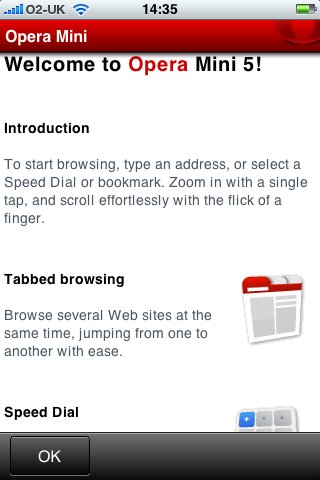
It was a bit slow to fire up first time round, but that improved on subsequent use. On first use, you are presented with an intro screen. Here’s the top half.
The other benefits it goes on to list are its ability to remember passwords, and the facility to synchronise your bookmarks and settings between your phone and your desktop computer.
Home page
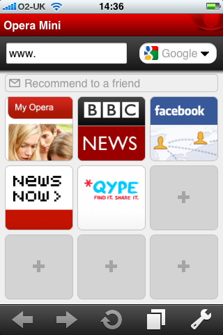
Intro screen over, we were off. Here’s the home page:
Handy for keeping your favourites at hand, but a little ugly for my tastes. Nice and easy to set up though.
Vertical to horizontal
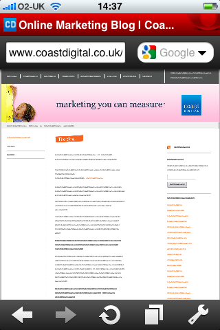
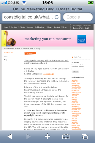
The first site I wanted to check out was our own, so I keyed in the URL. It rendered just fine, as you can see.
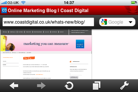
The problem comes when you turn the phone to get a landscape view, like so:
Instead of expanding to fit the space available, the site remains constrained by the portrait view dimensions. Compare this to Safari’s treatment.
Before:
After:
Much easier to read. Much clearer. Much better.
Tabbed browsing
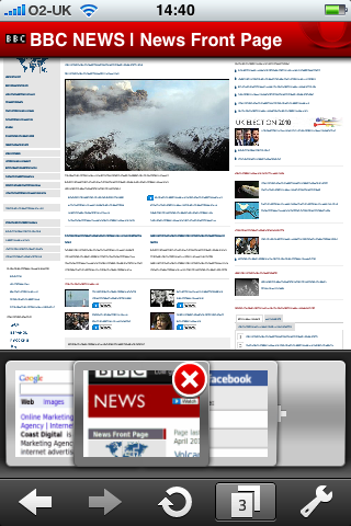
Again, the Opera approach is a bit clunky. In Safari, you can switch between tabs by sliding your finger horizontally across the screen. In Opera Mini you have to select the tabs button, and then slide thumbnails of the tabs from left to right. It works, but again it’s a bit ugly by comparison.
Some magic extras
I’ve saved the best bits till last, though. Opera Mini for the iPhone does have some nice additional features. The first one I like is the ability to switch to a full-screen mode.
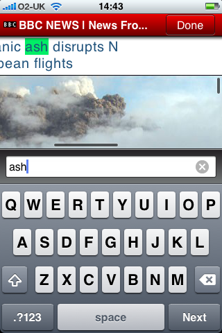
The second feature I like, which will come in handy for finding information on overly-long web pages, is the text search function. I used it here to find information about today’s volcanic explosion.
Summing up Opera Mini for the iPhone
I’ve only had a quick play, but overall I prefer the interface and beauty of Apple’s native Safari browser. That said, Opera has some handy tricks up its sleeve, particularly with the full screen mode and text search function – although the aesthetics could be a lot better.
The next question is whether Apple will incorporate features like this into Safari. I think the answer’s contained in that old story about the painter Whistler and Oscar Wilde.
Oscar Wilde: “I wish I had said that.”
Whistler: “You will, Oscar, you will.”

