This past week I attended UX London, an event organised and hosted by iconic Brighton agency Clearleft, where the brightest minds in User Experience converge at Trinity Laban in Greenwich for three days of nerdy designer fun.
Each day is themed, with talks in the morning and a variety of free workshops in the afternoon. This year’s themes were Design Strategy, Product Design and Design Practice.
Day 1 – Design Strategy
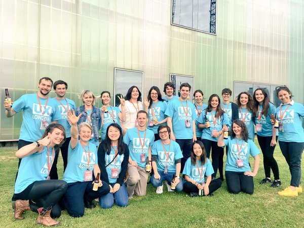
On the first day it rained, a lot. I was completely unprepared and got soaked during the 10 minute walk from Cutty Sark DLR to Laban. This being a user experience conference, the volunteers were handing out ponchos for people like myself who faced the prospect of further soakings at lunch and their journey home, which was much appreciated.

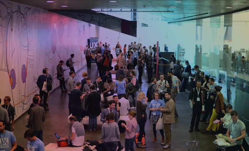
A warm welcome from Clearleft founder Andy Budd kick off proceedings. This was the 8th year of the conference, and he asked for a quick show of hands to see who had been to all eight. One hand went up from someone who worked at Clearleft, to a few sarcastic laughs. Quite a few hands where raised when he asked how many people had been the last 5, then 3 years including my own. But I was pretty shocked
when he asked how many people were here for the first time, when I would estimate 90% of the room raised their hands. Not to say that most of those people were brand new to UX, but I take it as an indicator of the continued growth of UX as a discipline.
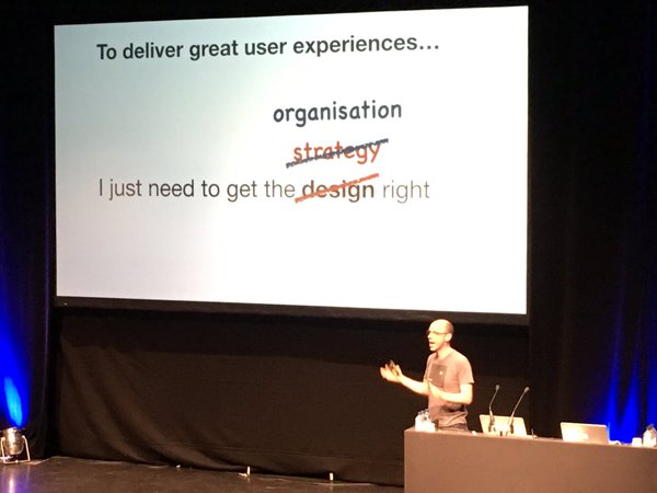
Peter Merholz kicked off the day’s talks with Org Design for Design Orgs. Peter co-founded on the most well known UX agencies Adaptive Path, so he knows better than most how to successfully structure design teams. He gave his thoughts on internal structures and the best way to place designers among other teams.
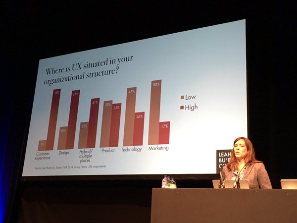
 Leah Buley
 followed, with a presentation on what high and low impact UX looks like in 2016. Based on her survey the State of UX, she believes the results show that UX has the most success in organisations where research and strategy are standard parts of the process, where UX leaders are at or above director level and where UX supports emerging digital channels. Fortunately all these are true here at Coast Digital, and we’re seeing the impact of putting user centred design at the heart of our day to day work.

After a short break
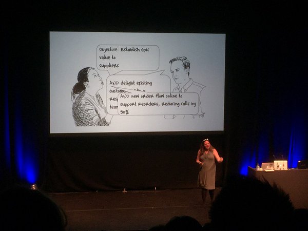
Christina Wodtke took to the stage and chatted about OKRs (Objectives and Key Results), which are measurable mission statements being used effectively by companies such as Google and Tesla. Christina was the best kind of presenter – funny, told a great story and left you wanting to know more. Fortunately she’s written a book on OKRs which I ordered when I got back to the office.
 Louise Downe
 was up next to talk about Service Design in government, in what was my favourite talk of the day. She went into detail about the huge and often boring challenges she faces, all with a huge smile on her face. Her enthusiasm for digital service design was infectious and inspiring, and I found it fascinating that she doesn’t hire specialist UX practitioners because user experience is everybody’s responsibility within her team.

The final talk of the day was the one that I had been looking forward to the most before the conference –
Marc Rettig’s Cultures of Creativity. I’ve been reading a lot of
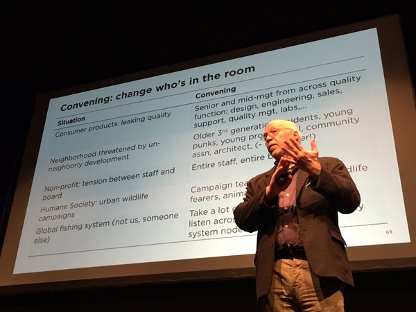
Marc’s writing on Medium lately and I was particularly interested to hear his thoughts on how to better communicate within teams and with clients. While his talk was fantastic, Marc’s presentation style was so relaxed, he was only able to scratch the surface of what his slide deck had to offer, despite running 10 minutes over. I was heading to his workshop in the afternoon for more detail.

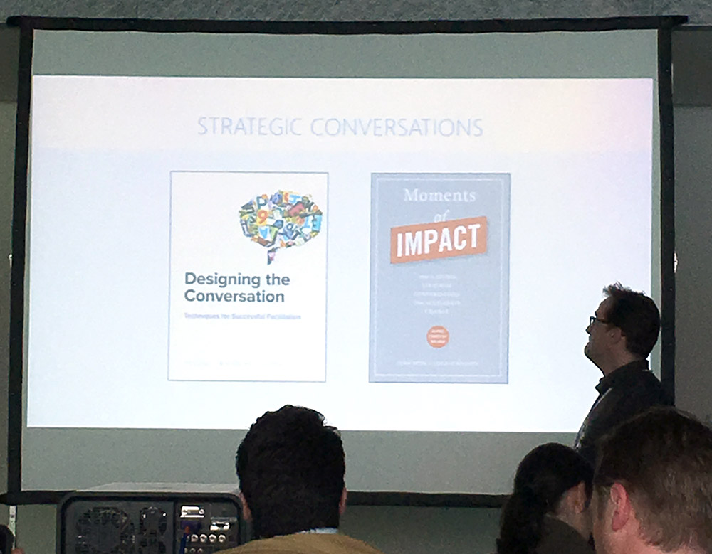
Marc Rettig’s afternoon workshop was a treasure trove of conversational techniques. We looked at how best to have open conversations with stakeholders, and techniques for addressing tough issues where internal politics are factor. “Don’t hide away from the hard stuff” was the message. Exercises included Collective Story Harvesting, World Cafe and active listening.
I walked away from the conference with my head full of techniques, thinking about what I could use now and what I needed to read more about.
Day 2 – Product Design
After yesterday’s rainy start I was glad to see the sun out, and headed out to day two of UX London ready to soak up another day of knowledge.
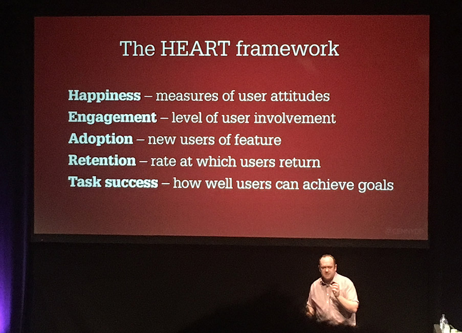
The opening talk was by Cennydd (pronounced Kenneth, more or less) Bowles, formally the design manager at Twitter in London. I’ve been following Cennydd on Twitter for a while now, and was interested to hear his talk. Titled Balanced Product Strategy, he made a case against over-reliance on data – how lean ideologies and experimentation are often replacing strategy, resulting in products iterating by adding features rather than removing them, leading to a lack of coherence. He suggested the best approach is to be data informed, not data driven, which makes a lot of sense to me.

The second talk of the day was from
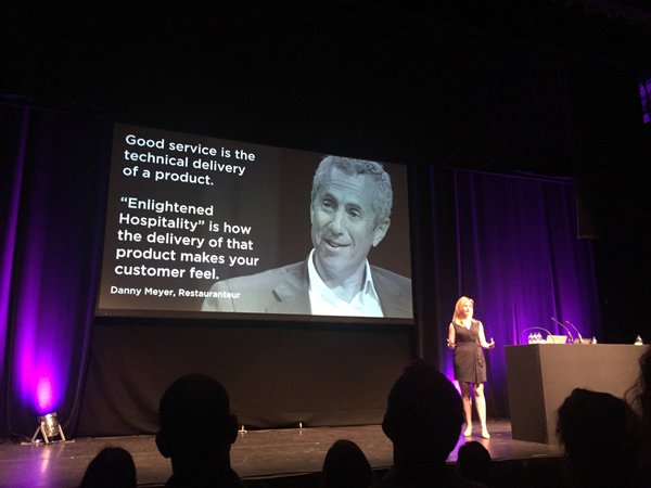
Melissa Perri, a designer and product manager. She spoke about Michelin star restaurants, and how the teamwork, innovation and customer experience required to win them are easily translatable to the work that we do.

The third talk of the day was from the wonderfully named Clara Gaggero Westaway, a creative designer who ran through some of the projects that she’d been working on recently. The first was a new way for elderly men and women to learn how to operate smartphones through the metaphor of a book, which was the end result of a process that began with creative play, and contextual testing.
She then talked about a creative solution her team came up with for a new bathroom scale that made people feel good about their weight. So many people hate weighing themselves and receiving bad news in the form of a number on a screen, and I was amazed by the simple yet innovative solution she created.
Next up was Erika Hall from Mule Design, someone who I’ve been following for a while on Twitter and through the Let’s Make Mistakes podcast. Like Cennydd earlier, she made a case against data, and in particular surveys. She didn’t hold back, tearing into bad surveys that are too easy to create and difficult to identify. She preached “If code is bad it will produce bugs, if a design is bad it will fail a usability test, but a bad survey has no smell, so when companies are making decisions that affect people’s lives we need to proceed with caution.” Quite, and it’s inspired me to write my own thoughts on what makes a good survey.

The last talk of the day was from
Dan Klyn. Now, maybe it was my rumbling stomach or the fact that he was reading his talk straight from notes on his laptop, but I really failed to connect with Dan’s message. And it was deep – he’s an accomplished Information Architect, and recounted metaphors between the digital and physical world throughout the history of architecture and poetry.

In the afternoon I headed to Jim Kalbach’s UX Strategy workshop. Jim kicked things off by defining general strategy and referenced the work of strategists Roger L. Martin and A.G. Lafley and their book Playing To Win, which I picked up afterwards. Jim then moved onto why organisations need a UX strategy, who should be driving it and how to create one using his
UX Strategy Blueprint. I came away from the session keen to use the blueprint and having created a strategy in the practical exercise I felt confident about doing so.
I ended the day with a couple of beers and the journey back home ready for day 3, the one I’d been looking forward to the most.
Day 3 – Design Practice
More rain, but I didn’t let it get me down because in my mind this was going to be the best day – in particular I was looking forward to the talk and workshop from Abby Covert, and she was first on stage when I arrived.
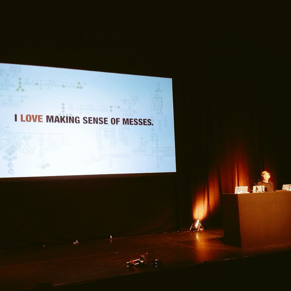
After reading Abby’s excellent book How To Make Sense of Any Mess last year, I was really keen to hear more and her talk touched on the themes of the book but included more examples and more detail. One of the most memorable lines from her talk was “if someone is trying to explain something to you and they’re waving their hands around, give them some paper – there’s a diagram in their head just waiting to come out”.

The past couple of years has seen a new set of prototyping tools emerge, with a focus on prototyping through use of animation. The second talk of the day was
The Principles of UX Choreography, with
Rebecca Assai from R/GA and
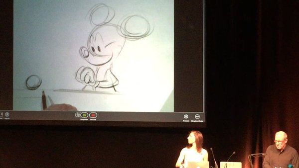
Glen Keane, an animator who worked at Disney for 35 years. Those who write about prototyping using tools such as Framer, Origami or Pixate often reference Disney’s 12 Principles of Animation, and Rebecca spoke through four of them while Glen gave examples by animating sketches of Disney characters live on stage. It was incredible to see him effortlessly draw classic Disney characters and bring them to life with the flick of a page.

Glen also presented a new animation tool he’s been testing at Google that allows him to draw in 3D space using a VR headset and controller, which was mind blowing. The audience gave the pair a standing ovation at the end of their time on the stage, the first time I’ve seen such a thing at a conference. I found myself leaving the room with tears in my eyes as I wandered over the coffee stand and I’m certain I wasn’t the only one. It really showed me the extent to which animation has the power to bring life and emotion into design.
After the break
Peter Smart whizzed through a section of his talk
The Future of the Web: And How to Prepare for it Now with some inspiring examples of cutting edge apps and experiences. Peter reminded us that the Internet is only around 9,000 days old – which seemed incredible to me, until I got a calculator out and kinda ruined it for myself.

ClearLeft’s own
Ben Sauer took the stage next and chatted about voice activated UIs, which he referred to as VUIs, and gave a balanced view of the pros and cons with examples such as Amazon’s Echo, Siri and Cortana. I’ve been thinking about screenless interfaces for a while and how they present an entirely different set of problems for designers like dealing with affordance, discoverability and natural language, and Ben presented his thoughts on these issues.

The last talk of the day and of the conference was Facebook’s Jonathon Colman, and it was bizarre. Full of odd references, theatre and animated sci-fi slides, it was roughly about ambiguity and unsolvable “wicked” problems that we often face. Jonathan warned us at the start that it was nothing to do with UX and everything to do with UX, and he was most certainly right.

In the afternoon I headed over to Abby Covert’s Information Architecture workshop. Titled
Information Architecture for Everybody, it covered four topics – Information, Ontology, Taxonomy and Choreography. Abby started by talking through the differences between data, content and information. “Information is whatever a user interprets from the arrangement or sequence of things they encounter” was the message. We moved onto Ontology and creation of a collective vocabulary, which seems like an infinitely useful asset that I intend to create during future client projects. Next was taxonomy, where we ran a card sorting exercise then talked about choreography, which I thought was particularly interesting. Alongside her own book she recommended
Andrew Hinton’s book Understanding Context, which I picked up when I got back to the office.
In all, the three days were exciting, beyond valuable, mentally exhausting and a lot of fun. I can’t wait to get back there next year!
