In a previous post I explored some of my highlights from UX Brighton 2017, specifically exploring the Cynefin framework and Systems Thinking. In this blog I’d like to give my thoughts on 2 more of the talks I saw, the first a methodical approach to the ordering and prioritisation of user tasks, the second an ethical look at the role played by designers in the modern world.

Top Tasks Methodology
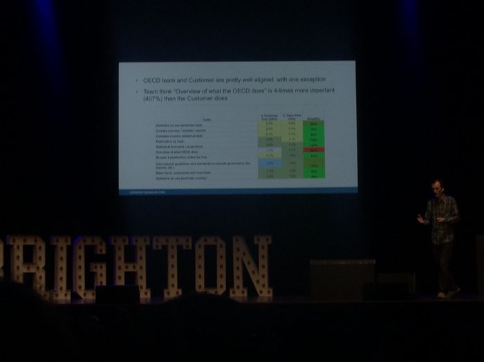
Gerry McGovern is a bit of a personal hero of mine since reading his book, Killer Web Content almost 8 years ago. It changed the way I thought about website content and copywriting, putting me on a path towards the consultancy role I’m in today. At the risk of sounding like a fanboy, this talk on the Top Tasks Methodology was my biggest takeaway from the day, not only due to the content, but also because of Gerry’s exuberant presenting style.
The Top Tasks methodology provides a way to strip away the noise with usability and really hone in on what matters to your users. It is based on a deceptively simple premise, collating all the tasks you expect users will or may want to perform on your website and then ask users to rank them in order of importance.
At a more detailed level it requires a significant amount of stakeholder engagement with as much of the organisation as possible. This means working with teams across the business using mediums such as the corporate strategy, social media, customer feedback and on-site behaviours to identify the tasks.
The next step is to shortlist the tasks, a process that requires a careful use of language to strip back tasks to their essence and ensure each is robust and concise. Some explanation of the task is allowed, but the main emphasis is on creating tasks that can be instantly understood, and easily rated by users.
The task list survey, by Gerry’s own admission breaks all the rules of survey design. 50-80 tasks in one long list and having users rank only 5 on a scale 1 to 5 shouldn’t work, but it has been successfully used over 400 times in the past 10 years. The argument is that because it is so overwhelming, the user responds with their gut instincts, rather than with the answers they think they should be providing.

Design Activism
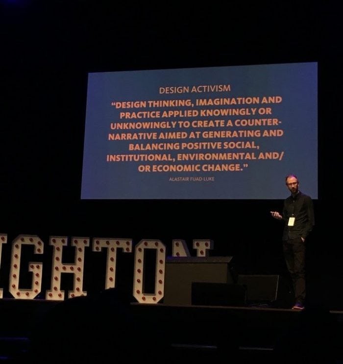
The final talk I’d like to cover was from Daniel Harris on Design Activism. In a thought provoking talk, Daniel highlighted the ways in which the internet and technology is permeating all aspects of life, and not always positively.

Daniel went further, stating we (as designers) also have an important role in shaping the future, influence over what these new systems and technologies can do and ultimately what impact they have upon our society. It was powerful stuff and certainly a point that resonated.
This year, UX Brighton balanced the practical with the theoretical and while there was too much to run through in a couple of blog posts, hopefully this has given a little insight into what was covered. I look forward to 2018’s event to see what the team can throw at us next time.
Photo credit: Siobhan Harris
