There’s nothing worse than a product with an overcomplicated design that forces you to take a series of complex steps to complete a task. I mean, there obviously are worse things, but for the sake of this article – there’s nothing worse!
User experience (UX) is all too often overlooked when it comes to things like product or website design and, as a result, products fail and businesses lose money.
In this article, discover some of the benefits of UX design and, in an uncharacteristic twist, check out a relatable, real-life example of how seemingly small factors can have a huge impact on user experience.
What is user experience design?
UX puts the user at the heart of your product, giving you a genuine understanding of the real-life problems people face so that you can swoop in with creative, carefully designed solutions to help eliminate those problems.
The benefits of user-friendly designs
The advantages and leverage that UX research gives you are numerous and undeniable. Here are just 3 of the biggest benefits you can enjoy when you keep your users at the core of your offering:
Increase your sales
Not to put too fine a point on it, if you create a product that’s simple to use, easy to understand, and that works, people are more likely to buy it.
Reduce costs
By putting users at the forefront of your design, you’re much more likely to eliminate the majority of usability problems early in the process, saving you time, money and backpedalling when you’re much further into the process.
Boost customer loyalty
At the end of the day, any customer who has a good experience with your product or business is likely to come back time and time again. Building a positive relationship and trust with your user base is vital for any company hoping for repeat business.
A real-life, Covid-connected example
What better way to explain what I mean than with a real-life example? I hate to bring up the coronavirus, but it does serve as a poignant example for the point I’m trying to make here – which, in case you’ve forgotten, is that UX design is critically important.
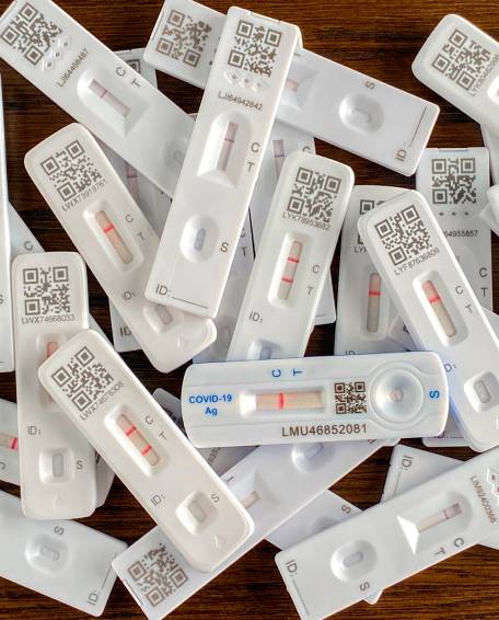
Have you ever wondered what the C, T and S on COVID-19 lateral flow tests (LFTs) stand for? Even if you do know, it’s not clear – certainly not to us commonfolk, anyway. The current markings are obviously the result of clever people designing things for other clever people .
As we are all probably aware by now, the lateral flow tests show you’re positive for COVID-19 with a red line appearing next to the C and T on your device. If you’re negative, it will just have a line next to the C. Simple, right? Wrong! When you look into what all the letters on your lateral flow test stand for, it’s still confusing.
For anyone who doesn’t know, this is what each letter stands for:
- The S is for sample (makes sense).
- The C is for control (ok, I understand that).
- The T stands for test (in what world does that mean positive?!).
So, how could this have been made simpler?
Not that I was consulted, but if “they” had asked me, I’d have suggested using the international language of symbols and pictograms. This would work for everyone, no matter what language they spoke, for example:
I went ahead and mocked this up on an LFT for an even better visual (you’re welcome):
The tick clearly shows that the test is viable, the specific coronavirus symbol would cause no confusion over whether the test is positive, and the third symbol is obvious – clearly showing that you need four drops of the solution to carry out your test.
These simple changes instantly make the lateral flow test easier to use and understand, making everybody’s lives easier – a win-win if you ask me!
Got a product or website that needs improvement?
Let our team of UX specialists do the heavy lifting. Our in-house and mobile UX Biometrics Lab boasts some of the most cutting-edge neuromarketing technology available on marketing today, including eye-tracking software, sweat sensors, and facial expression analysis, so you can find out how your users really feel, not just what they think.
Get in touch today to find out more!
