Setting user experience benchmarks
Adnams wanted the online store to better replicate the offline store experience, and additionally we sought to create a modern, responsive website that would be optimised for mobile devices.
The existing Adnams website was essentially two websites within one: a promotional website and a store.
To assess the functionality of the existing website, we held a user testing session at an Adnams shop to engage directly with their customers, where we were able to record them using the website to make a purchase. This exposed where customers struggled to complete a purchase; whether navigating the store, finding a particular product or completing the checkout process.
The findings from these assessments helped us to form an approach for the design of the new online store and website.
We discovered that people wanted to buy products far more than they wanted to find information on them.
Creating a design that’s fit for purpose
We discovered that people wanted to buy products far more than they wanted to find information on them.
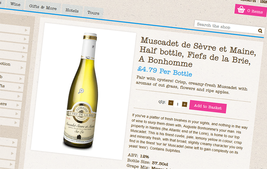
This informed the decision to make the store the main focus of the website – with promotional material as supporting information on product-selling pages.
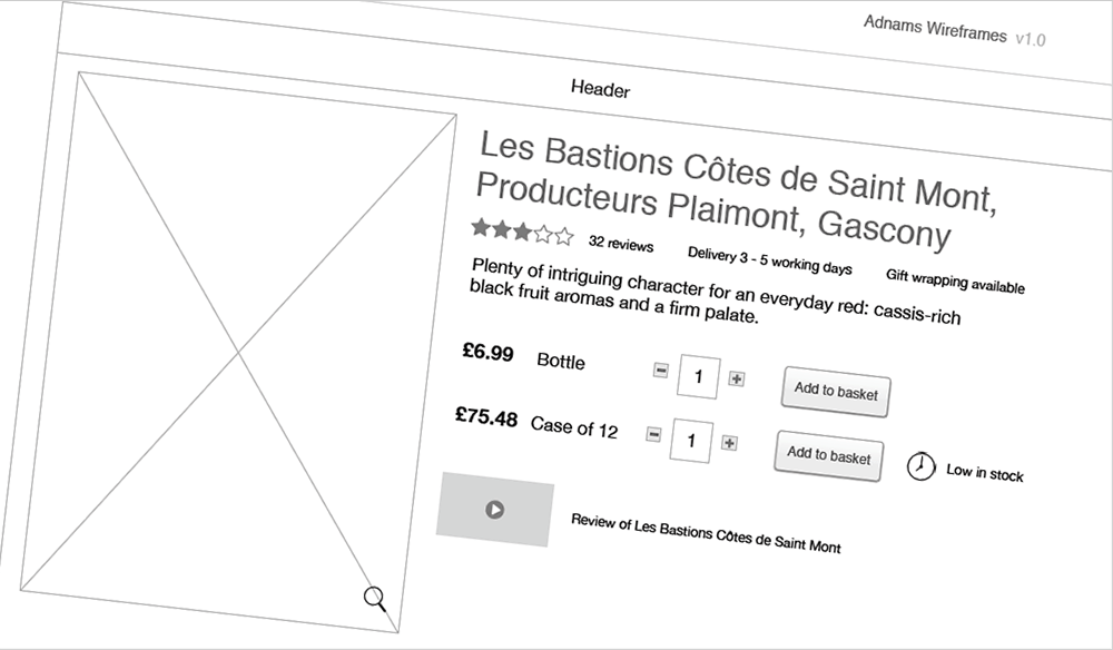
A core part of the process was testing the wireframes and redesigning the user journey – with customer motivation and accessibility as imperative factors.
Following a data review which showed a trending growth in mobile traffic, a mobile-friendly website became an important part of the project – both from an SEO and UX perspective.
Following this data review, further stakeholder interviews, and contextual research at an Adnams store, we created wireframes and a visual designs for all device platforms using brand guidelines and promotional graphics supplied by Adnams. This prototype was then tested with users, with final tweaks then based on their feedback.
The results
We provided Adnams with all the visual assets, ready for development. Our prototype offered a vastly improved user experience, and the client was very happy with our findings and the final product.


