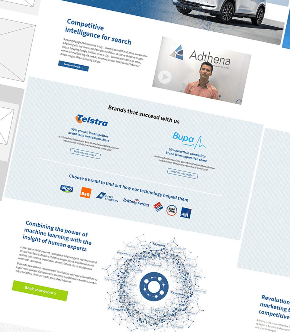
Adthena is a competitive intelligence tool for search marketing, giving its users unrivalled competitor clarity in an often overwhelming paid search marketplace.
Knowing that their users – whether those be paid search specialists or strategic decision makers – were likely to be digital savvy, meant that having a website that is modern, responsive and easy to use became vital to the ongoing growth of the business.
Expanding a complex offering into a competitive marketplace
Adthena’s competitive intelligence tool is a complex offering and one that was looking to expand rapidly into a market already dominated by several well-known brands. While Adthena’s tool offers insights their competitors can’t, carving out a space within that marketplace was a key objective.
Adthena’s tool was growing – and continues to develop and change to this day – but their previous website had fallen behind the tools evolving capabilities. As such, differentiating the offering was difficult because the website wasn’t accurately representing the tool. Furthermore, due to an out-of-date CMS, making changes was time consuming and frustrating.
Finally, the previous site wasn’t responsive. Considering the growing share of mobile traffic and the digital savvy nature of the audience, this rapidly became a priority within the project.
A research driven approach to understanding the challenge
The research state of the project was key to overcoming some of these initial challenges. An in-depth data review allowed us to confirm that an investment in mobile was a necessity, while stakeholder interviews allowed us to understand where the website needed to be in in terms of messaging.
We then sat down for a collaborative workshop with the key stakeholders from Adthena and the involved experts here at Elixirr Digital. This session allowed us to hash out how the website should be structured, which parts of the tool’s multifaceted offering to focus on, and how the design and copy of the website could better align with Adthena’s developing sales strategy.
This then allowed for the creation of a new information architecture and navigation that helped to better differentiate Adthena from their competitors.
From wireframe, to design, to delivery
Armed with the necessary information to move forward, we then got to grips with laying out and designing the site.
This process started with wireframes, before moving onto design and then finally the build of the site. At each stage we ensured that key stakeholders at Adthena were kept updated of our progress, and given the necessary assets to provide feedback and sign off.
Elixirr Digital have been pivotal in the success of our digital marketing. From the beginning of our partnership, their research, planning, and build of our new website is first class. We now have a fully functioning website and a set of diverse supporting campaigns capable of generating leads for our SAAS business across the globe. The Elixirr Digital team are a pleasure to work with and bring smart ideas that continually move us forward.
Ashley Fletcher,
VP of Marketing, Adthena
Related case studies
Featured Service
Website Development
Build secure, high-performance websites tailored to your business needs.
Featured Service
Website Design
Develop stunning, user-friendly websites that align with business goals.


