About the brand
Camm and Hooper are a specialist firm offering event and venue hire across seven unique locations.
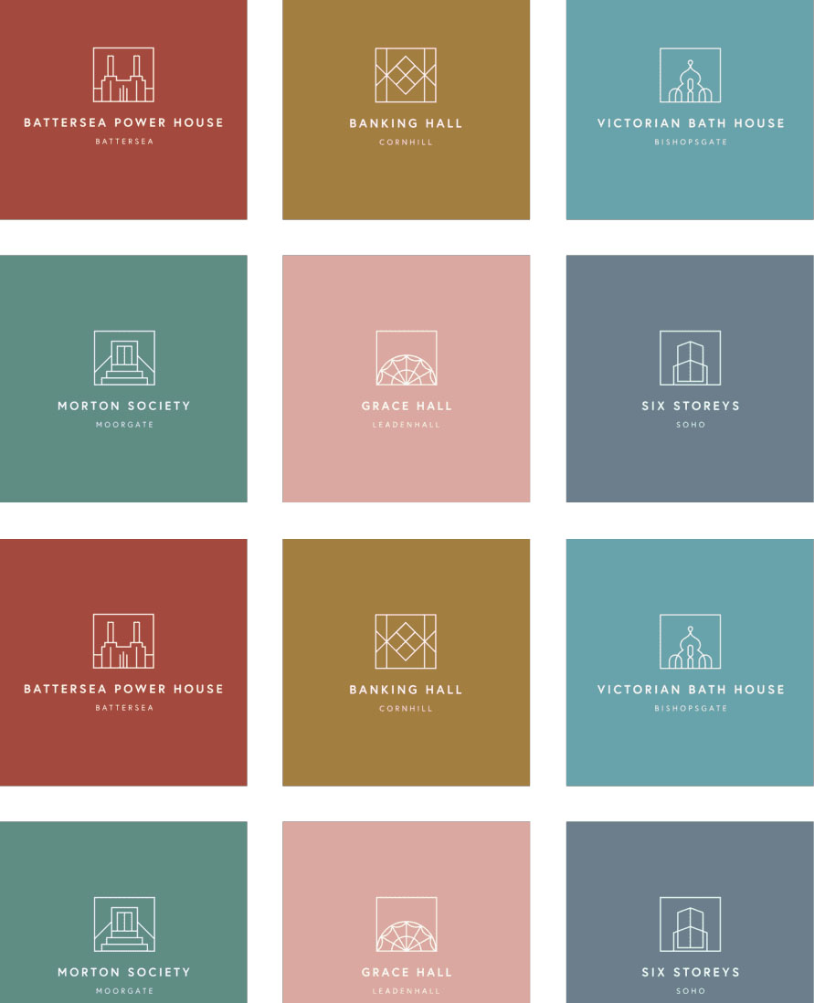
This brand needed help creating a cohesive and compelling brand architecture for the umbrella company and each of their distinctive venues. We decided to use the historic idiosyncrasies from each location as inspiration.
We developed a suite of icons, one for each venue, each with its own accent colour. They work individually for each venue, and as part of the C&H collection. We have found it easy to add new venues to the collection as the approach is so flexible.
Highlights
Discovery – Working on a brand begins with understanding the personality of the company, or in this case venue you are working with. This discovery phase took us round the hidden gems of London that make up the C&H collection for immersive site visits.
Icon design – Hand drawn icons that began as on-site hand drawn sketches. They bring real personality and identity to this suite of logos.
Colour – We worked closely with Camm & Hooper to find the colours that resonated with each individual venue, working with the icon we had created, and forming part of the wider C&H collection colour palette.
Working with Elixirr Digital is a pleasure. The service they provide is efficient and effective. Their ability to manage large projects is excellent, keeping you in the know every step of the way.
Rebecca Hadley,
Head of Marketing, Camm & Hooper
Related case studies
Featured Service
Brand Design
Craft unique visual identities for cohesive and impactful branding.


