A comprehensive approach to research
As with any new website design, a solid foundation of understanding is the essential first step. As such, we invested heavily in early stage research, taking the time to fully comprehend the business and user requirements. This research consisted of:
- A large stakeholder workshop
- A data and marketplace review
- In-depth telephone interviews with users
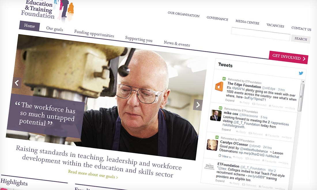
As part of an end to end digital solution, the design team used mood boards to establish a visual direction and went on to create a modern and uncluttered aesthetic for the site.
Key findings were presented back to the Foundation Team. These findings went beyond establishing how the audience expected to use any website, but also highlighted feelings towards the Foundation and its role within the sector. In conjunction with the research, personas for each important user group were created to provide reference points to the research for the rest of the project.
Creating a user-aligned web presence
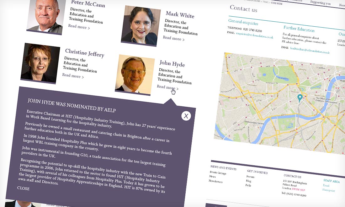
Basing the information architecture on the research findings, we then created a functioning prototype that allowed for dynamic feedback loops through the specification process. This prototype used the carefully crafted sitemap and functional specification grown from user requirements laid down in the research.
As part of an end to end digital solution, the design team used mood boards to establish a visual direction and went on to create a modern and uncluttered aesthetic for the site. Built as a responsive design using WordPress, we also supported The Foundation team with dedicated CMS training and a ‘writing for the web’ skills session for members of the Communications team.
A successful launch and positive response
Within a tight deadline of 7 weeks, the project was completed. To gain instant feedback, the site was launched with the hashtag #foundationupandrunning, which returned a positive response.
From a statistical point of view, the website has shown encouraging initial results, with visits up 18% compared to the month pre-launch. Onsite engagement has also improved with an increase in page views of 72% and a 10% reduction in bounce rate.
Onsite engagement has also improved with an increase in page views of 72% and a 10% reduction in bounce rate.
Internally, the stakeholders were also impressed with the results of the project, with Duncan Anderson Brown, Director of Transition and Procurement exclaiming that the new website looked “fantastic” and Lindsay Wright (Head of Communications and Stakeholder Engagement) professing that “all the feedback so far has been extremely positive. Many thanks for producing such a brilliant resource both for the Foundation and the sector.”
A user led approach from the outset
From first suggesting a user-led approach to using personas at every stage of specification and design through to successful build and launch, the Education and Training Foundation website has shown the value of user research in achieving a web presence that is aligned with the needs, goals and motivations of a specific audience.


